Motivation behind icons
Fresh out of school, I began my career at a sign-making advertising agency, gaining invaluable practical experience with various advertising materials and print production techniques.
However, as I ventured into freelance graphic design, my work quickly expanded to include web and mobile app interface design. This shift revealed an urgent need for high-quality symbols and icons.
The most influential in my journey were the AIGA symbol signs by Roger Cook and Don Shanosky, Otto Neurath’s Isotypes (including the graphic work of Gerd Arntz), and Susan Kare iconic designs for the Apple Macintosh. All of them impacted me profoundly, driving me to create my own library of icons and symbols, despite doubts about matching my role models’ genius.
From sacred to universal
In our world, an array of pictograms, symbols, and icons blend seamlessly into our daily lives, often unnoticed due to their intuitive design and usage.
The term icon, originally referred to religious imagery, but it has evolved to encompass detailed, sometimes decorative or entertaining, imagery. But symbols are slightly different, it’s our way of visually representing concepts, ideas, or meanings that words alone cannot capture. My fascination has always been mostly with pictograms — the ultimate challenge in visual communication, as they must convey information instantaneously, minimizing any chance for misinterpretation.
Why am I even summarizing it here? So you know, that GLYPHICONS® draw their inspiration primarily from the world of pictograms and symbols. This influence is evident in their simplistic appearance, which lends them a timeless quality and versatility.
Design for today's world
It’s important to recognize that while original pictograms were effective in their era, when things looked differently and also wasn’t necessary to replicate these symbols digitally, in today’s world, their shape and form needed a fresh approach.
With that being said, it should be clear the preview below doesn’t try comparing apples to oranges, it should simply demonstrate the change in visual appearance of things and the need to have icons in more uniform size, as their primal use has shifted from signs and prints, in to user interfaces on various devices we are using today.

GLYPHICONS® are designed to offer uniformity and adaptability, meeting contemporary needs without losing the essence of traditional symbolism. There are more reasons that led me to start creating my own set of icons and symbols, but here are the most important ones.
Contemporary design
The internet is awash with monochromatic icons rooted in outdated designs. As these fail to evolve, their meanings become obscured, especially to younger audiences.
Adaptable and easy to use
My client projects range widely, necessitating a versatile symbol resource that can be easily modified, combined, or scaled without sacrificing quality.
Consistency
Often, finding a coherent icon set is challenging. Many collections lack uniformity, leading to a tedious and costly process of sourcing from multiple sets, usually with unsatisfying results.
Beyond icons
Over a decade of dedication culminated in the launch of the first GLYPHICONS® set in late 2010, with GLYPHICONS.com s.r.o. established in 2012. By 2016, GLYPHICONS® had achieved registered trademark status globally.
Today, GLYPHICONS® are utilized by a diverse range of users, from independent designers to global corporations and government organizations.
My future ambitions don’t lie in creating the largest icon pack or maximizing profits. Instead, I am committed to continuously refining and improving these icons.
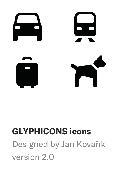
Jan Kovařík
Author of GLYPHICONS®