The first version of the Label font
January 03, 2024By Jan KovaříkUpdates
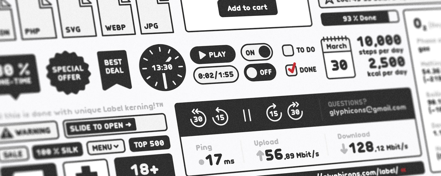
Last fall, I was working on a small set of custom icons, and several of them required the integration of short numerical values. Additionally, the client needed a few small illustrations, a number of which should also contain brief texts.
While I usually try to discourage my clients from using any text in icons (or illustrations, for that matter), in this particular case, it was necessary and, most importantly, ultimately beneficial for users.
These were not my first icons or illustrations made with text, but once I started to work on them, I realized that there might be a better way to add letters and numbers to GLYPHICONS icons.
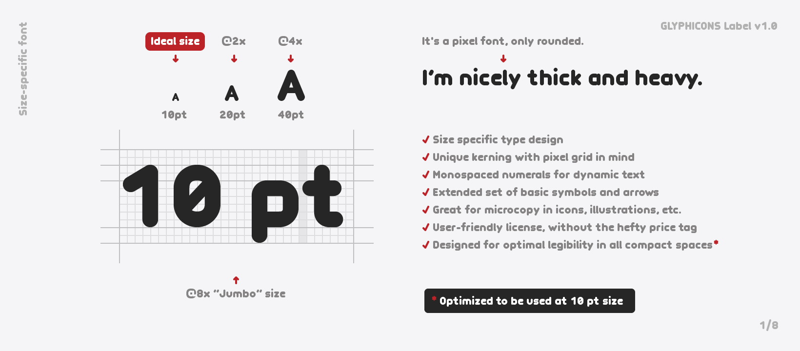
Size-specific type design
I already had a full set of basic Latin characters and numbers drawn in my working AI file. This included the entire alphabet, along with numbers from 0 to 9, in an approximate size of 10 px for the capital letters. You may actually find some of these icons with letters or numbers in various GLYPHICONS sets right now.
The problem was, I always had to copy and paste each glyph manually and reposition one next to another in order to create new words or numerical values. I was always working basically from scratch, and that led me to the idea of creating a standalone font.
Monospaced numbers
The very first (testing) version contained only the basic Latin alphabet and numbers, which weren’t monospaced but proportional, just like regular letters. This meant that each number had its own defined width to match its natural shape.
But then I remembered I had read somewhere that when numbers are not monospaced, it can cause a problem when you want to animate them or simply change them dynamically as text.
Anyway, on top of this fact, even for static icon-labeling, it was more convenient to have all numbers non-proportional (monospaced), with a fixed width. In a traditional typeface, it’s usually the entire style that is either proportional or not, but in the Label font, only the numbers have exactly the same width.
Unique kerning with pixel grid in mind
In the font, each glyph has its own defined space that it occupies, including its sidebearings (empty spaces on both sides of the glyph).
But sidebearings are only enough to define the very basic space between characters, and it’s usually necessary to define and adjust spaces between certain pairs of characters – using kerning.
So I created a lot of kerning pairs that help not only with the optical balance between letters but, again, with the specific purpose of Label in mind, also keep each glyph always aligned on the pixel grid.
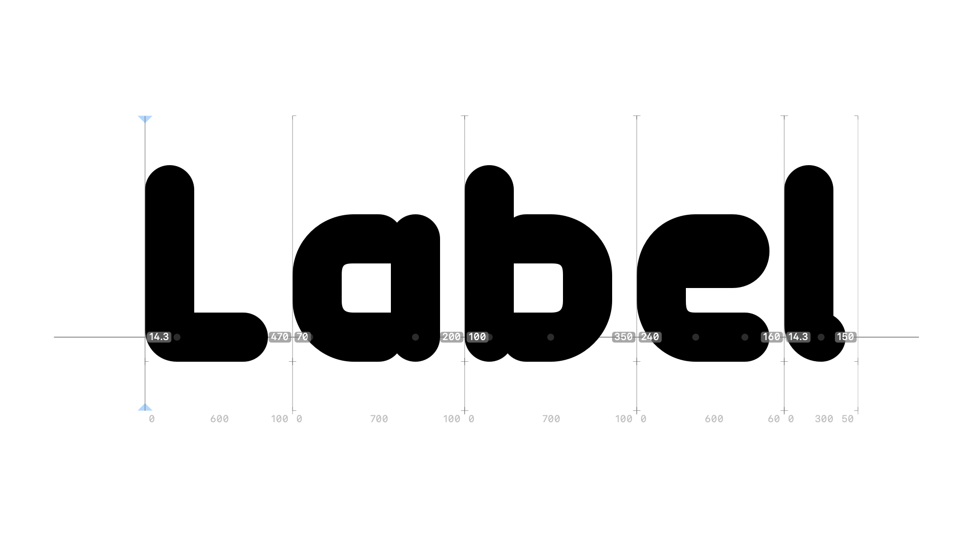
Of course, I was (and still am) fully aware that this approach is kind of a ‘double-edged sword.’ On one hand, it really keeps everything as sharp as possible when working with icons and illustrations, but on the other hand, when used at some atypical or larger sizes, it might be necessary to adjust the kerning between certain pairs of characters individually.
So, with all this information in mind, you can use Label for almost anything really, but you always have to keep in mind not only the advantages but also the limitations that arise from its specific purpose.
No hinting?
I found out that it’s actually better to turn off automatic hinting, and after a few experiments, I decided it might be better to not use any hinting at all, in order to keep the shape of each glyph undeformed and aligned to the pixel grid.
Multilanguage support
Once I had it working with the basic Latin alphabet, I thought it would be nice to create other missing glyphs to support more Latin-based languages. It was quite a challenge to learn which set of characters are needed for certain languages, but Hyperglot helped me tremendously in this regard.
And of course, I have to also mention the great Glyphs app, which I’ve been using before to create desktop icon fonts and which helped me the most when creating the Label font.
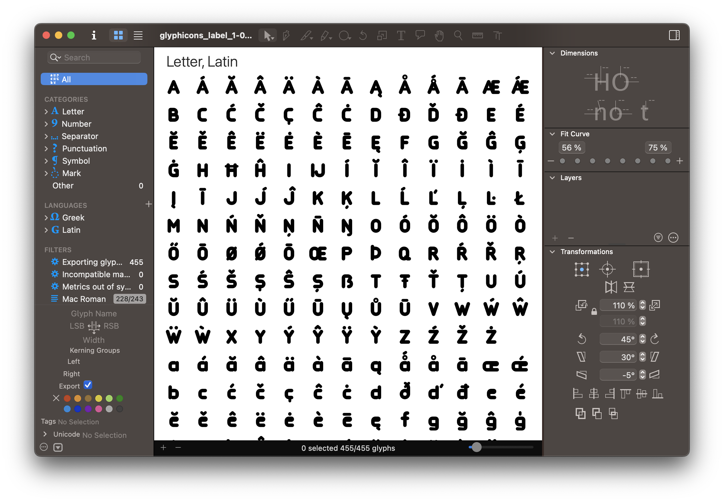
Extended set of basic symbols and arrows
Having spent so much time with all the alphabet characters, it became obvious that it would be great to also cover basic special characters, marks, symbols, and punctuation – just in case someone might need some of these ‘extra’ glyphs in their microcopy, wherever it may be.
Free & User-friendly license
Since the creation of the entire font took a large amount of time (much more than I originally intended), at first, I set a fair price for Label at which it should be sold, and I also added a free version with a CC BY 4.0 license.
But, it felt somehow underfair to all existing GLYPHICONS customers, so I reversed that logic and created a special ‘Label free license’ which automatically grants almost unlimited use to all GLYPHICONS customers who have bought any icon set or collection. The free version with the CC BY 4.0 license remained available for everyone else.
So, if you need a regular license, the same as it is for icons, all it takes is to buy any GLYPHICONS icon set or collection – if you already have one, you’re all set, and you can just download the Label font.
Label is an experiment, work in progress
Label was born to help ease my process of making custom icons, but I’ve already found it useful for a few applications outside of icons, so I hope it will help you too.
What do you think about Label? Let me know at: glyphicons@gmail.com.
Jan Kovařík

Hi, I'm Jan, an independent graphic designer and the creator of GLYPHICONS. I've been designing these icons since 2010. I'm all about brand identity, creating logos and everything that represents your business for more than eighteen years.