Introducing the new Humans set
December 08, 2019By Jan KovaříkUpdates
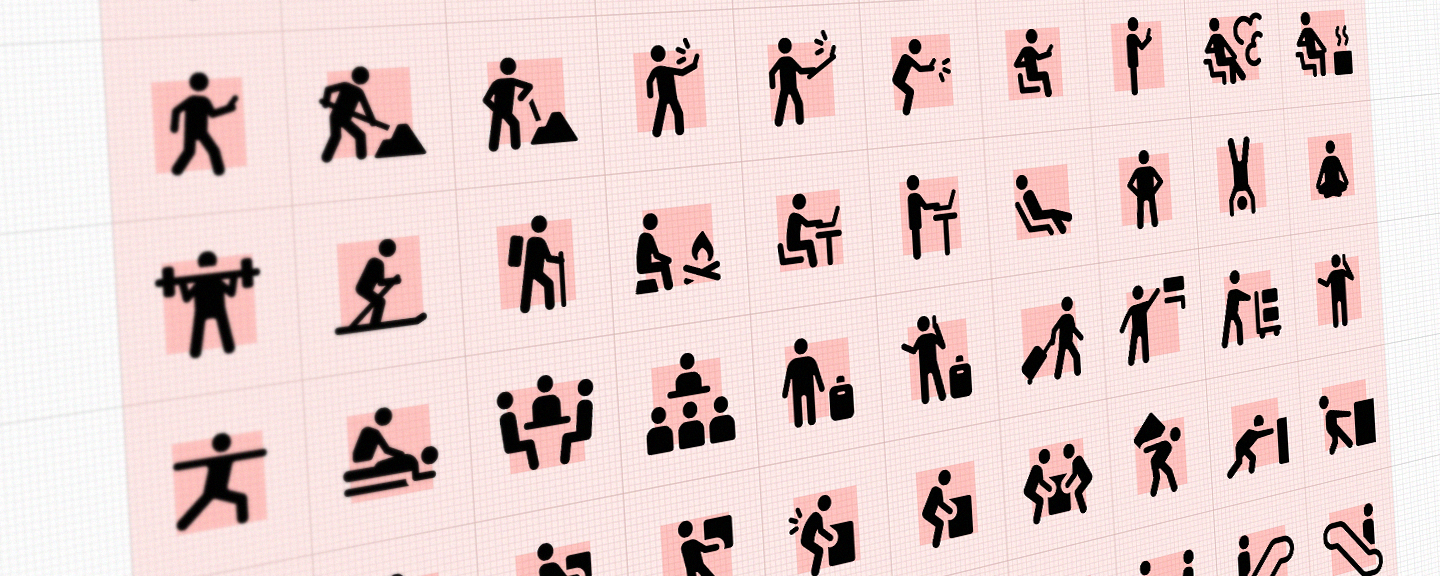
This new set of people's silhouettes is a combination of traditional pictograms and modern icons. They come in handy anytime you need to express something concerning people's actions or activities and since they share visual language and attributes with the rest of the GLYPHICONS sets, it's great to use them together.
I know it’s been a while and I was promising this set for a long time. Also you may remember a few similar icons with human figures been removed from the Basic set during update 2.0 – the reason was simple: I wanted to re-create them later as a standalone icon set, because I think they deserve more attention and care, than just being a few complementary icons, so this way I can devote more time to their development and gradually improve them, as I do with other icon sets.
What's behind this set?
When I started to work on them, I wasn’t looking for a direct replacement of commonly used pictograms, but rather their improved version, which would be visually more compatible with other GLYPHICONS icons, with more united, and above all, contemporary design.
These stick figures, although they may seem very simple, can’t look exactly the same as regular GLYPHICONS icons, mainly because the shape of average human body simply isn’t a square :) So I had to find a solution that would allow me to keep the approximate and correct proportions of the human body and visual language of the rest of the GLYPHICONS sets at the same time. The result is these familiarly looking icons, with a little bit more detail and thinner face.
During last few years, many of my customers asked for these additional various human figures and when they couldn’t find any, they ended up using various pictograms downloaded or bought from various sources on the internet. But these had often numerous flaws and were either visually obsolete or incompatible with other GLYPHICONS icons. Using them together simply didn’t feel ok and many of them were even technically defective.
Of course there are some exceptions, but using any pictograms or similar icons today, require proper thinking through in advance. Most of the similar sets (or symbol signs, pictograms) were made either a long time ago or by an inexperienced designer, which may bring a number of hidden problems and these are basically the main reasons, why I decided to start creating Humans set.
- The vast majority of pictograms were originally created and intended almost solely for physical application. It may not be obvious at the first glance, but in their time, most of these pictograms and symbols had been printed, cut from the foil, painted on sings by the road, but only rarely shown on any display in sense how we know them and use today. In a time of their origin, it made all perfect sense, it simply wasn't necessary, but everything is different today.
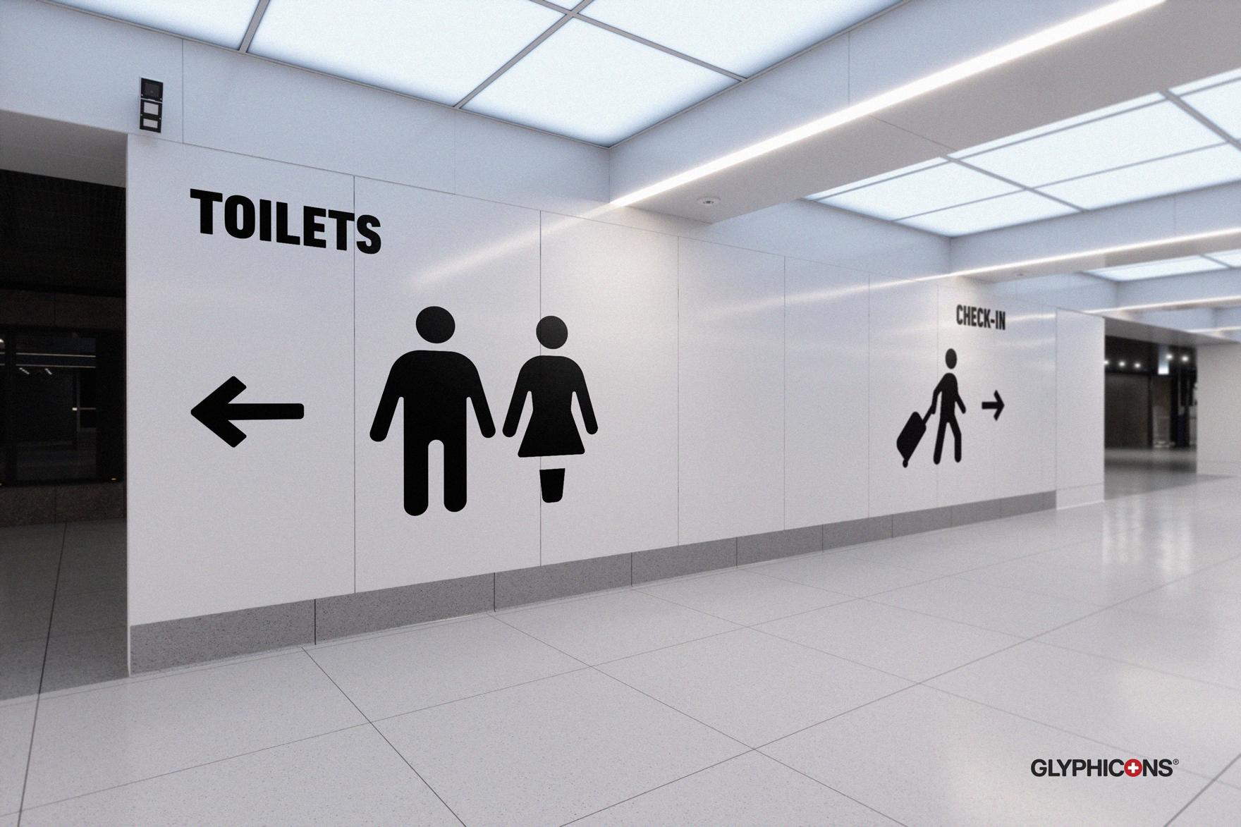
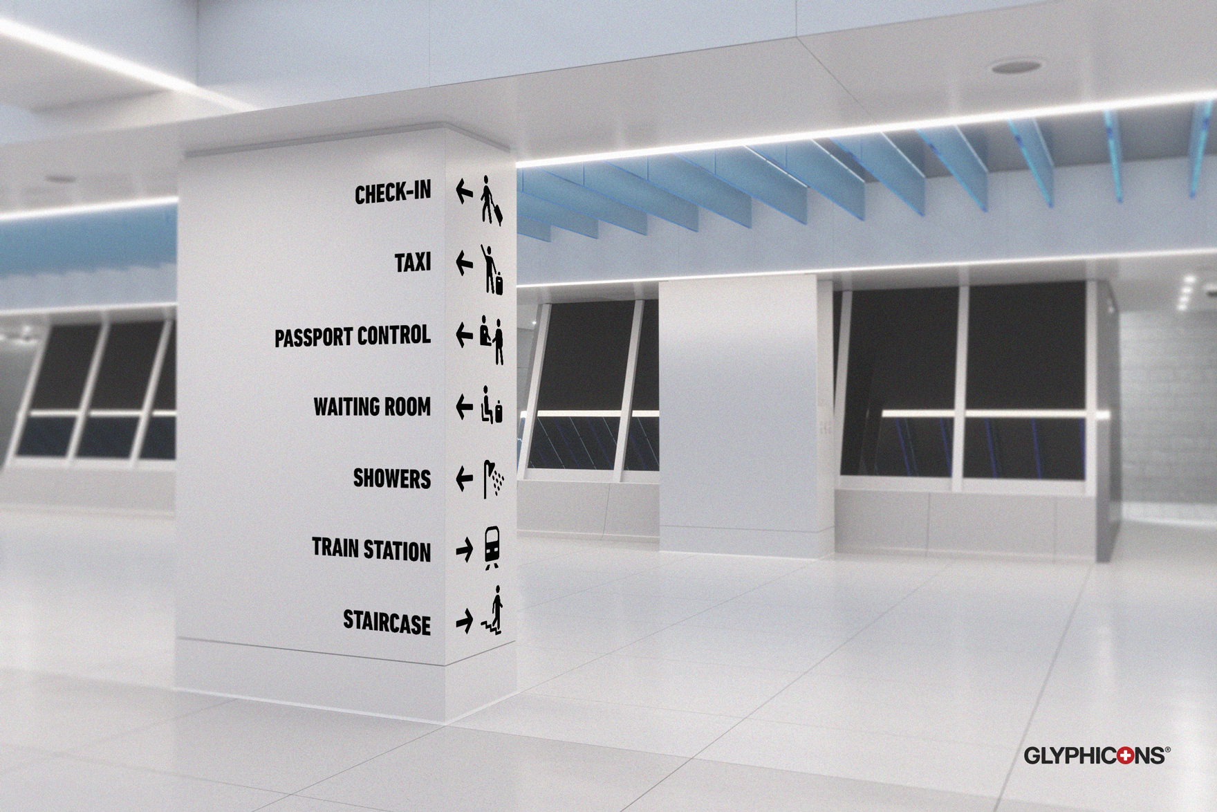
At the present time, a large part of routine work of conventional graphic designer still includes printed design, so the attribute/ability to scale the size of these icons almost indefinitely, while keeping them recognizable and aesthetic, is absolutely fundamental and necessary. Icons in the the new Humans set are made, compared to their predecessors, with a pixel grid in mind, so when used correctly, these icons will always be looking sharp and easy to read: from their smallest default size on screens of all kinds, to the prints in billboard sizes, where you'd spot every tiny fault in their design instantly. - The appearance of the things they were supposed to represent became outdated. We use lot of symbols and pictograms subconsciously, out of habit, but a younger generation often struggles to recognize them. For example all "travel" related pictograms, usually show travel luggage from previous century, literally. I think that today (2019/2020), it's safe to presume that the vast majority of the world population uses completely different luggage when traveling. It doesn't mean that these classic suitcases don't exist anymore, but it's no longer a typical shape of travel luggage of the majority around the world.
That's just one example for many and yes, the truth is, that many other shapes don't change that radically, but I'm (and I'm going to) to keep all of GLYPHICONS icons/symbols as much contemporary looking and up to date, as possible. The hard part is not being too much ahead or too late, with the design of these symbols, but searching for this imaginary and ever-changing ideal, is one of the reasons I work on GLYPHICONS. - Pictograms are not icons. Pictograms are usually more complex and communicate multiple information in a single image, than a simple icon or symbol, as they often include warning, command, authorization or recommendation layer and thus contain multiple graphical elements and colors to express all of it. What's maybe even more important, they were, in most cases, tailored to blend visually with its surroundings or work within existing design language, to fit in a certain space or event (airports, hotels, signs by the road, public places, Olympic games, etc.), so it isn't wise to copy&paste them in your design without deeper thinking first.
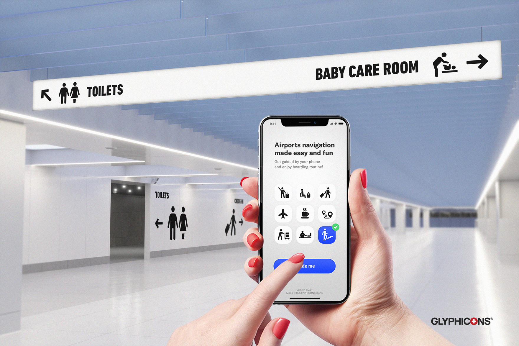
My intention with Humans set was to create visually neutral and more versatile shapes of humans figures, which would work nicely not only with the rest of the GLYPHICONS sets, but also as standalone symbols and icons, whenever needed. So anybody who is already using another set of icons (let's say the Basic set), can use them easily side by side. More experienced users can even combine them and create more complex custom pictograms, signs, posters or whole way finding systems.
Don't forget about context
You probably already know that, but any icon or symbol has to be used in a proper context in order to send a message you want. I emphasize this here, because it’s especially important with these new icons from Humans set. When choosing and placing an icon, you always have to keep in mind the target audience, its social and cultural background and future physical surroundings of the icon itself, in order to transmit the message you want and not confuse or even offend someone.
While all GLYPHICONS sets are made to be as neutral as possible, the designer working with them has to always consider all circumstances and remain responsible not only for their selection, but above all for the correct and appropriate application. I’ll try to dive deep in this topic and explain it this in more detail in a standalone article later here on the blog.
Try them out!
They are great literally wherever you need to explain or show something concerning humans. Hope these icons will become another permanent part of your design library and will play their part in your daily work. Please, let me know your opinion once you try them out at: glyphicons@gmail.com, I look forward to see the results!
Jan Kovařík

Hi, I'm Jan, an independent graphic designer and the creator of GLYPHICONS. I've been designing these icons since 2010. I'm all about brand identity, creating logos and everything that represents your business for more than eighteen years.